How To: Blending Colored Pencils on Stamped Images
Colored pencils are my new favorite tool. I love that they don't bleed through. I love that you can just sharpen them and go on your way. But the best thing is blending them together to create entirely new colors, gradients, and more.
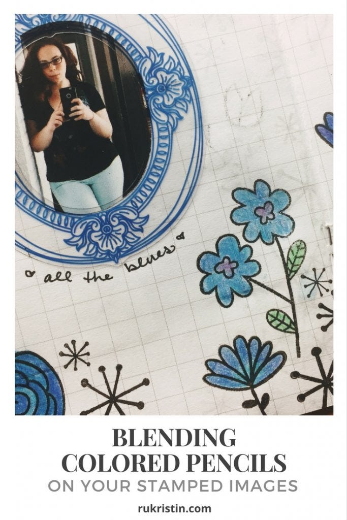
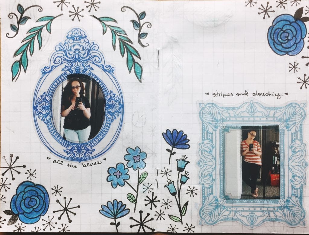
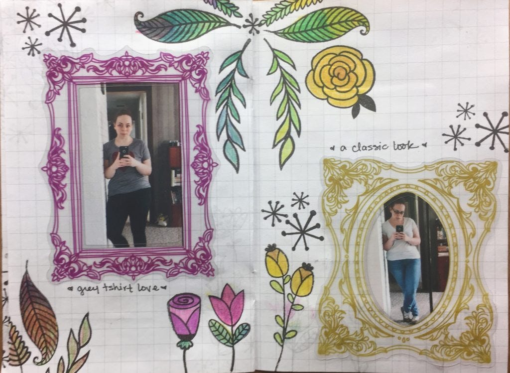
I recently got to work on a cool project for the Altenew 3rd Birthday Blog Hop as part of my Freckled Fawn design team duties. For this project, I started with a pre-made notebook. The inside pages are decorated with Freckled Fawn clear acrylic frames (from the April kit), the Altenew Hello Sunshine stamp set, black ink (VersaFine) and two sets of colored pencils (Jane Davenport and Spectrum Noir - Florals). The full project, with some instructions on how I put together the project, is up on the Freckled Fawn blog.
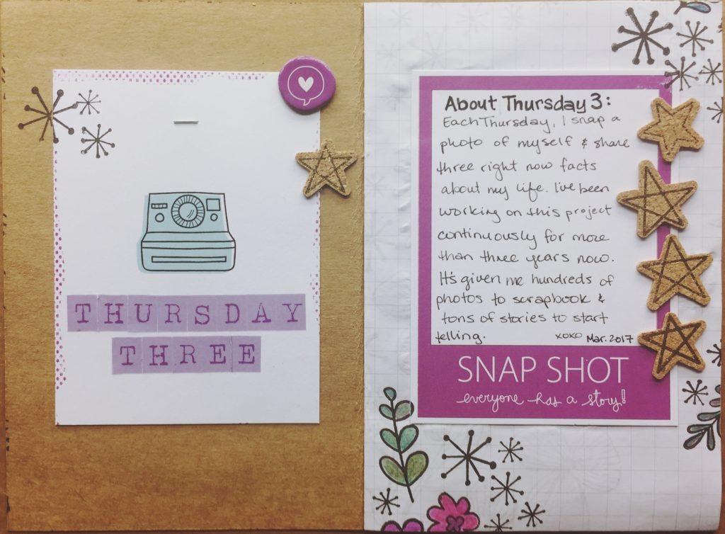
But today I want to share a few tips on blending colored pencils on your stamped images. As we all know, I'm a huge background stamp fan. I absolutely adore stamping background pages. My go-to stamping/coloring combination is usually Staz-On ink and watercolors or markers. The notebook I was using had thin pages, so watercolors or markers were not going to work. I grabbed my colored pencils and switched to Versafine ink (it's so smooth). I stamped as I would normally, and then started using the colored pencils to add color to the pages.
Here are a few tips on blending on your stamped images with your colored pencils:
Pick out a few colors in the same color family
The best way to start blending your colors is to pick out a few colors in the same color family and practice a gradient/ombre effect. In this project, I chose a different color family for each set of pages (matching the colors of the frames). Keeping the number of colors to a minimum helps keep things from getting overwhelming and from introducing way too much into a single page. This works especially well on florals that have some of the most beautiful natural color gradients on Earth.
Use light pressure to leave more room for additional colors
The lighter you color, the more room you'll have for additional colors. This is true for all colors, even dark colors like black, burgundy, and plum. It's much easier to blend colors when there is room for each of the colors to have their own space before they meld together.
Build up layers
Build up your layers. In the last tip, I said to use light pressure, it'll leave you more room for additional colors. This is where you use that additional room. By building up layers upon layers, you'll be able to blend and create even more unique colors. Even if you only want to blend two colors, start lightly and build up from there. You'll have greater control over your end color.
Work in the same direction
I've found that coloring in a single direction (all vertical/all horizontal) keeps everything neat, and makes it easier to blend colors together. When the coloring gets a little haphazard, you then need to color in harder for your second layer, and then even harder for the third layer. Which then totally screws up our 'using light pressure to leave more room' tip from above.
Practice on scratch paper
If all else fails, or you need to know exactly what blended colors are going to look like before putting them on the page, grab a sheet of scratch paper. I keep a sheet of scratch paper next to me every time I'm coloring with my pencils. Also, sometimes it's fun to just color on the scratch paper until you find a color that works for you.
I've had the best time blending my colored pencils in this project. Thanks so much for letting me share a few of my favorite tips with you.
View the full project on the Freckled Fawn blog.


